Before
After
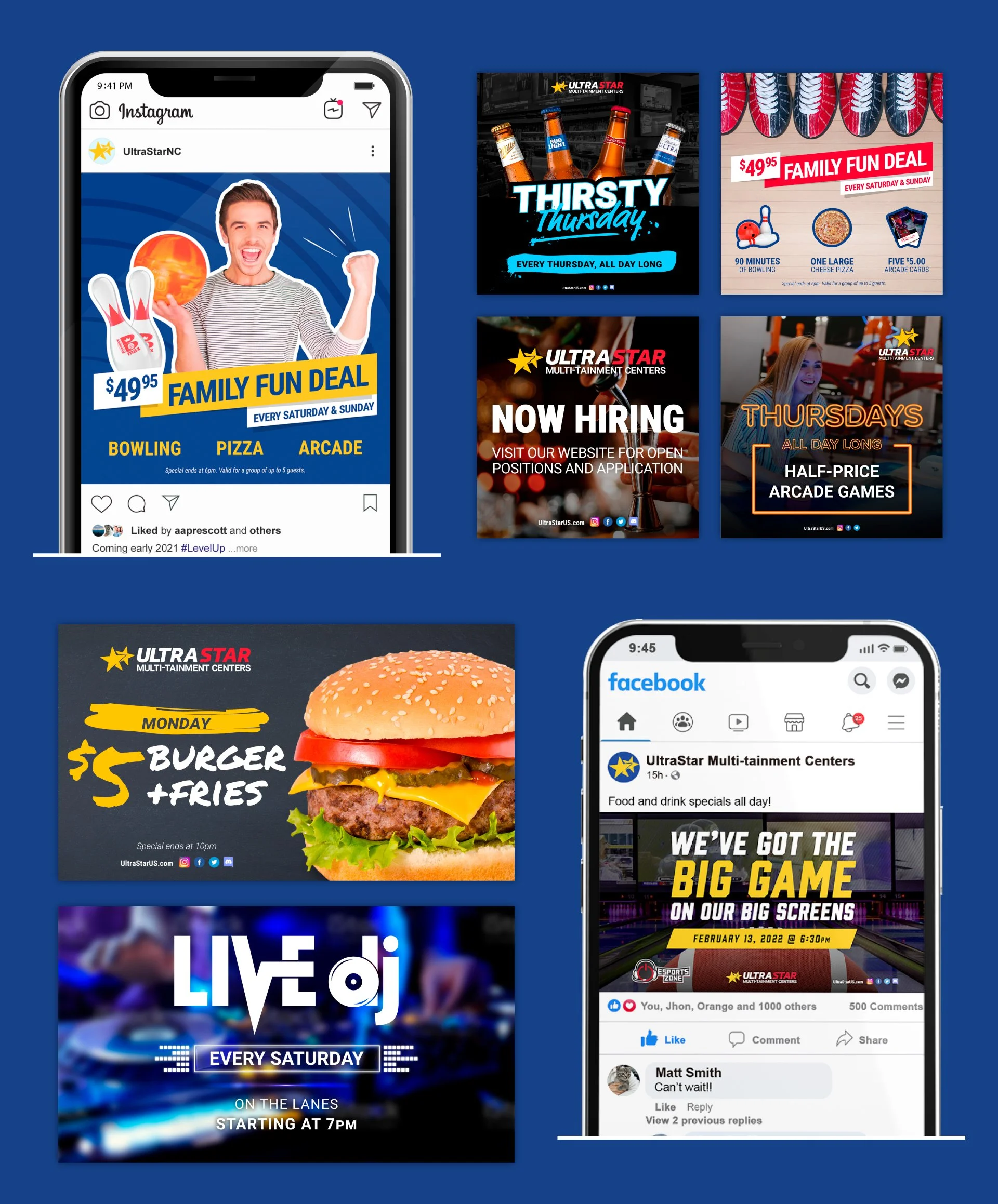
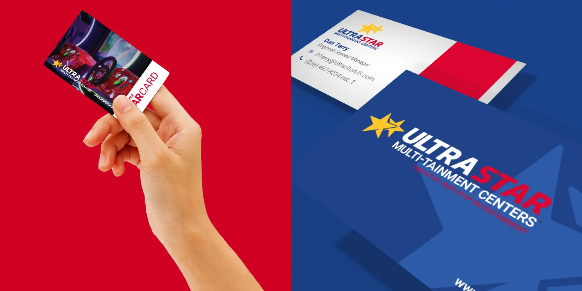
UltraStar Multi-Tainment got it’s start in southern California as UltraStar Cinemas, and then expanded to Arizona, then western North Carolina. As a result of the pandemic in 2020, UltraStar dropped the Arizona location and vastly scaled back it’s operation, including downsizing the design department to a single designer. This designer re-branded UltraStar in 2020 and came up with the “before” logo as well as the identity system below. This was a huge upgrade from their previous logo and identity, however, the brand still felt cold, corporate, and very inconsistent. The UltraStar blue was the only consistent brand color they used throughout the visual identity, and pair that with a mulititude of fonts and stock images and you have a very inconsistent and unexcited brand.
Samples of old identity
UltraStar hired me in May of 2024. They had their new look for a few years and needed someone to update their brand assets, create signage, re-start their social media pages, and overall, breathe some fresh life into the brand. They gave me creative freedom, but said they loved the logo, so that stays.
There are a few issues with the logo, but if we can’t change it, we’ll give it some personality.
I dropped the white background across the entire identity, animated the logo, and introduced a friendly script font to compliment the primary and secondary fonts.
Then I got to work on updating EVERYTHING.
Refreshed logo with motion
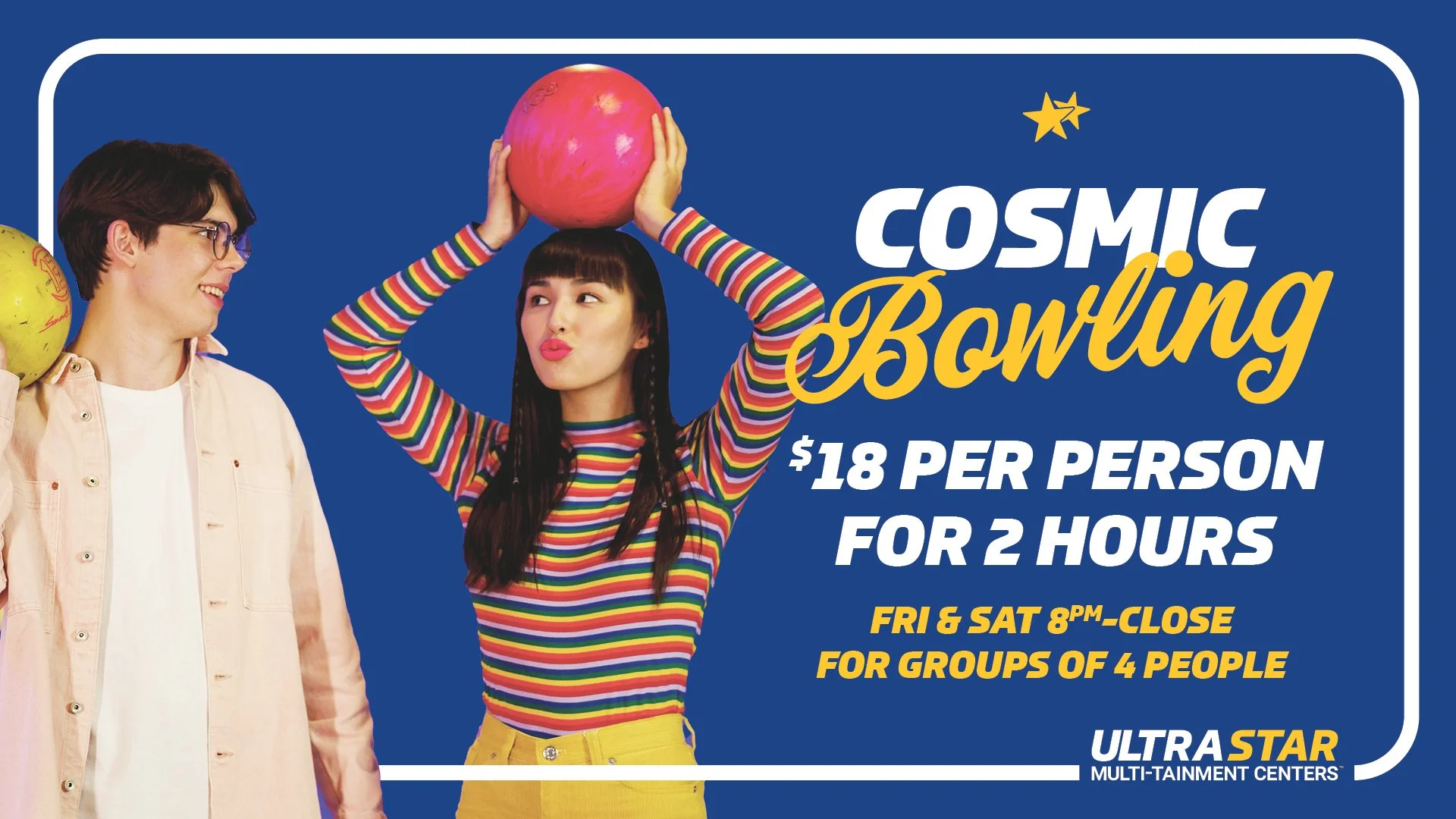
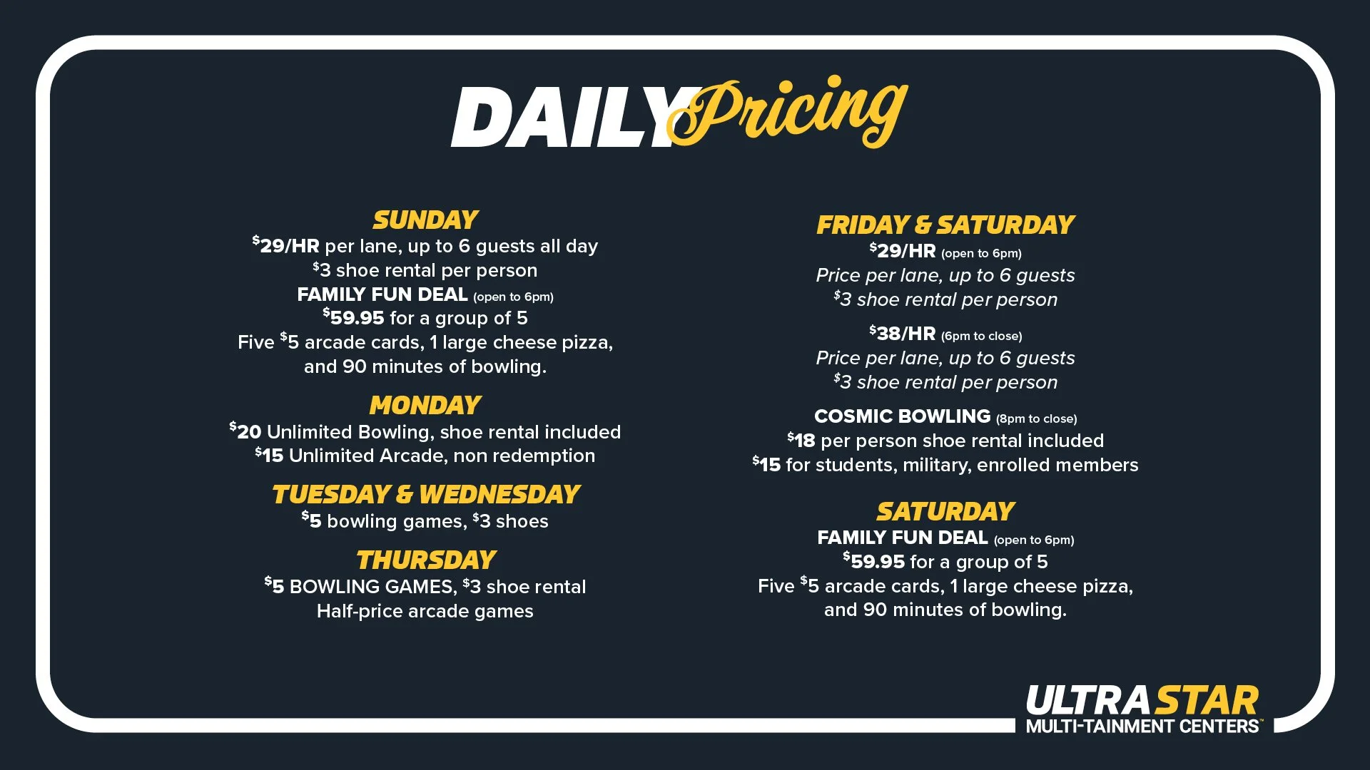
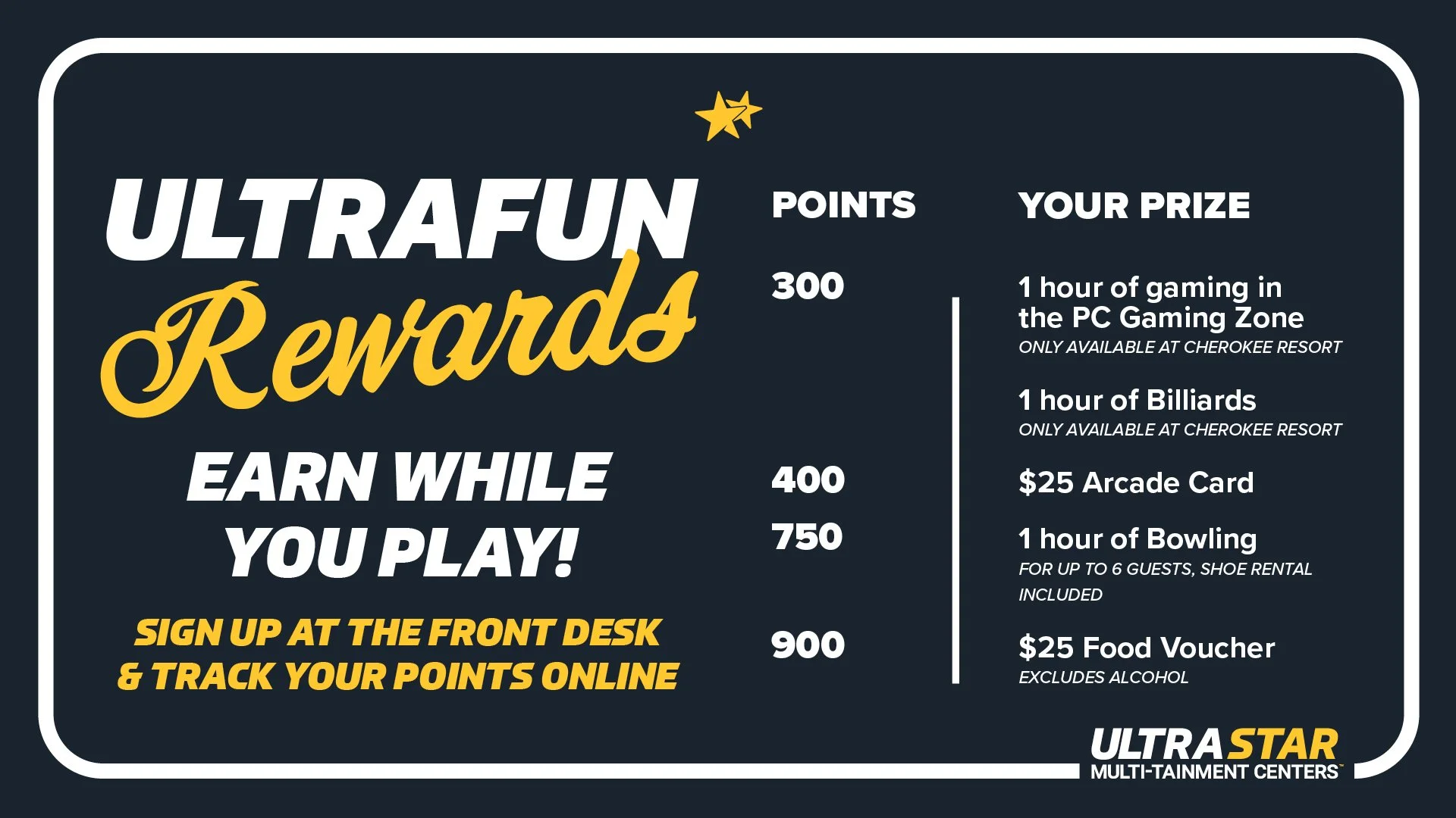
Internal digital signage
Branding colors assigned to each section of UltraStar
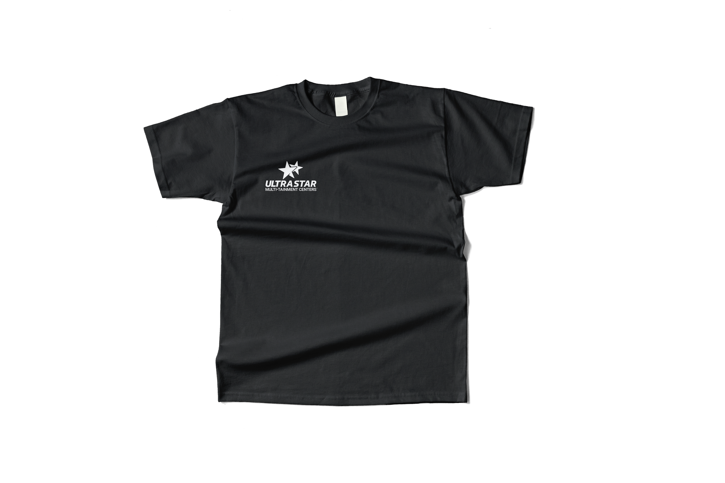
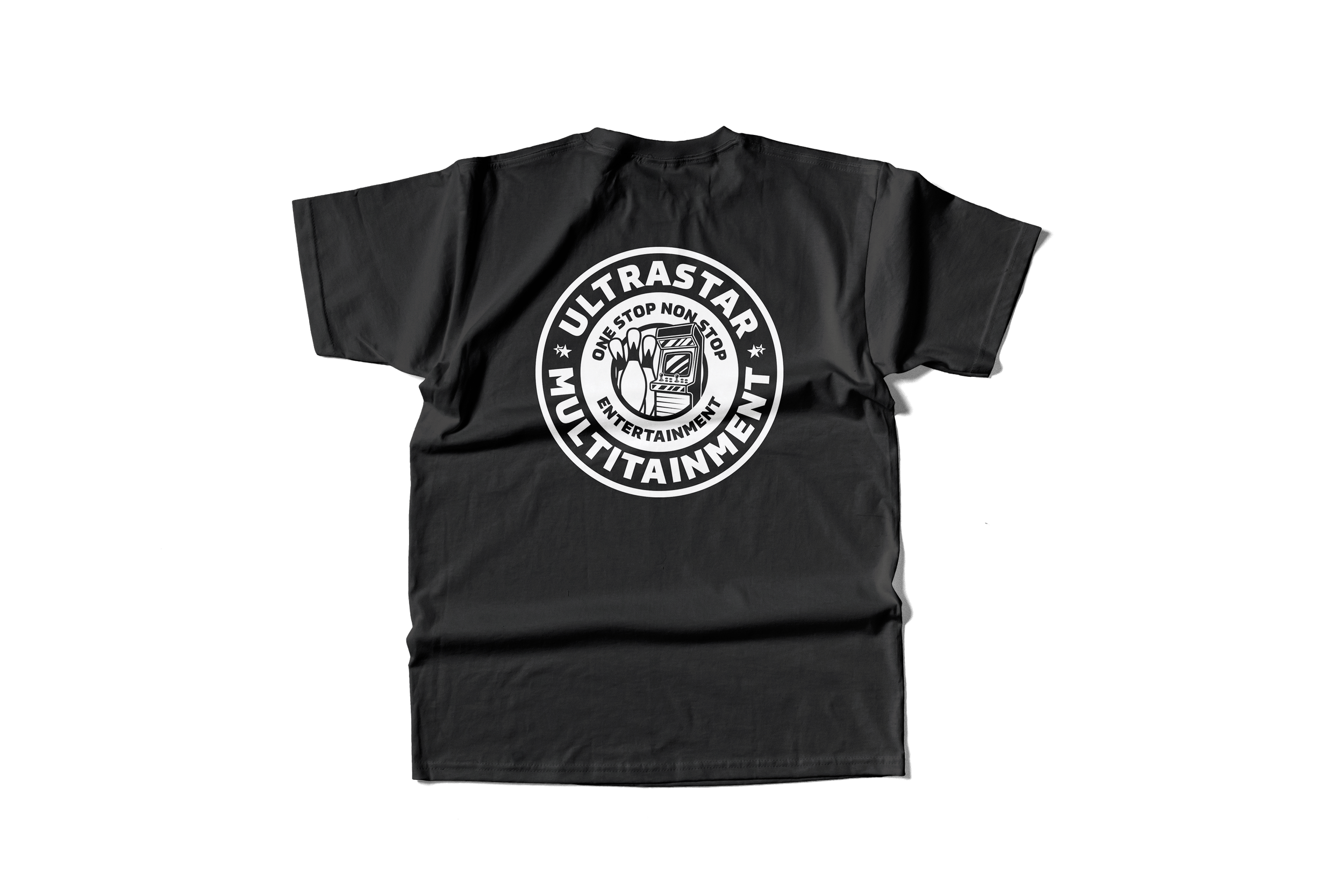
Bowling and Arcade Attendant Shirts
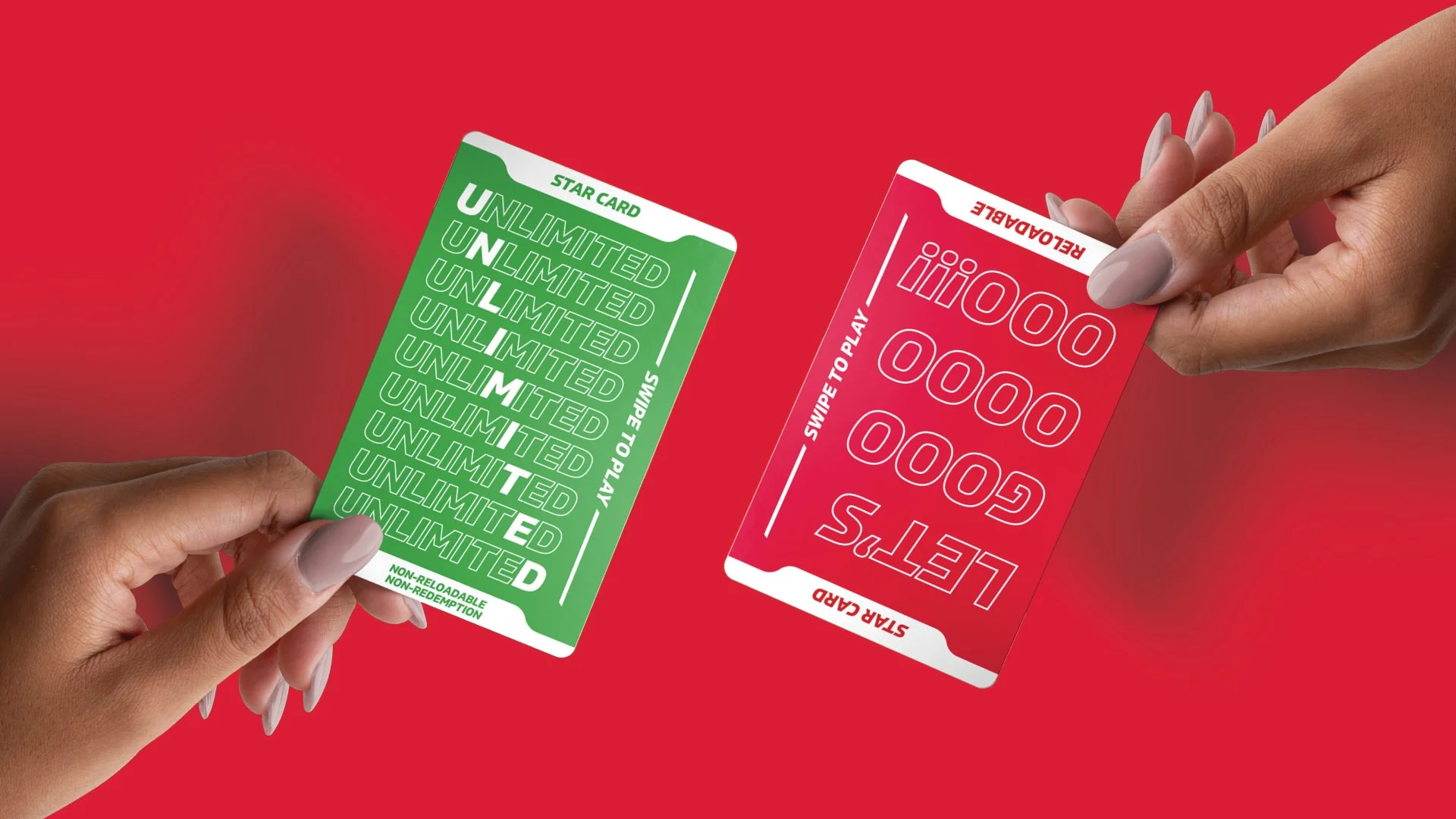
New Arcade Cards
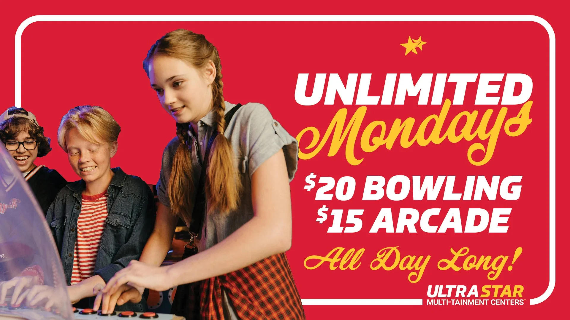
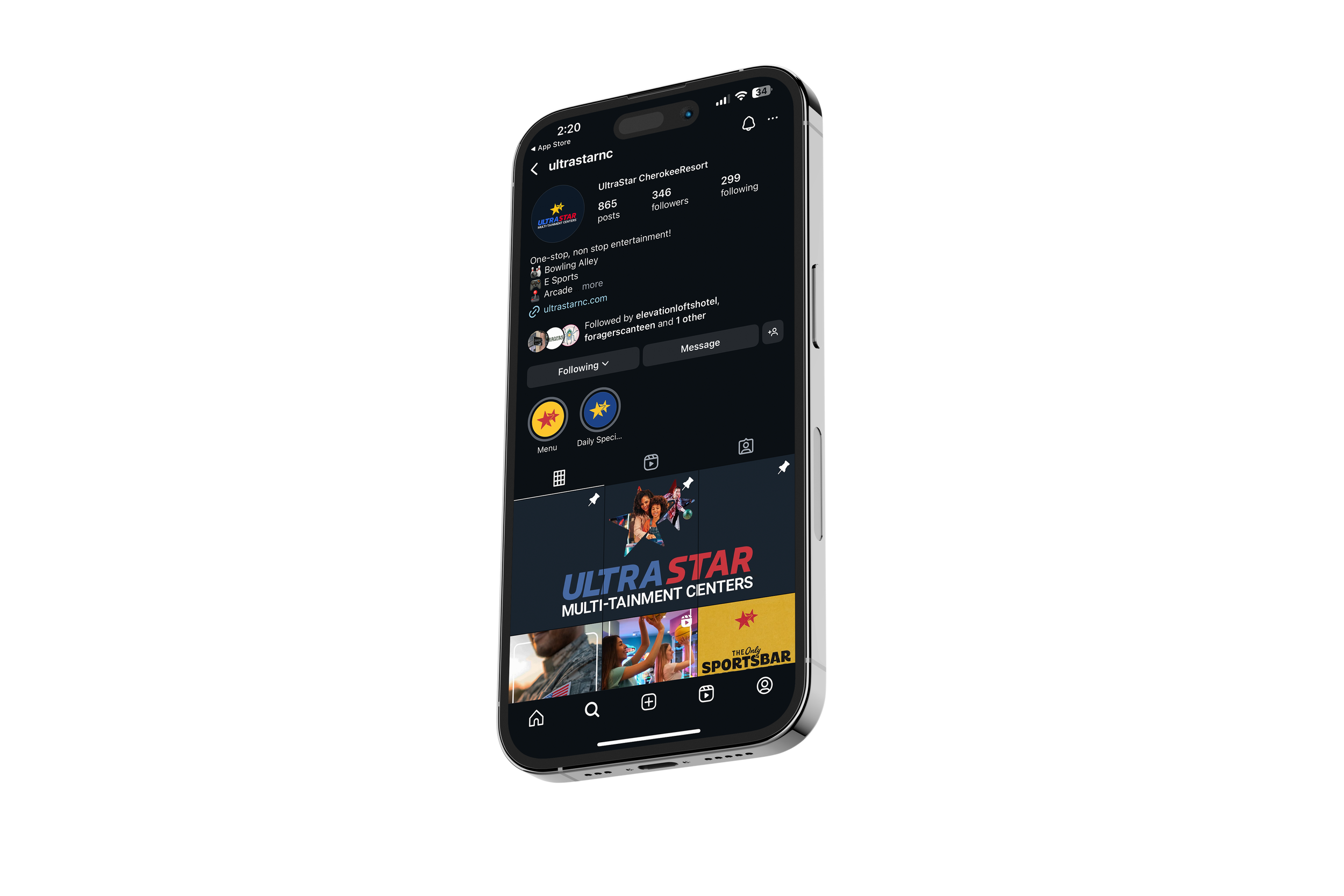
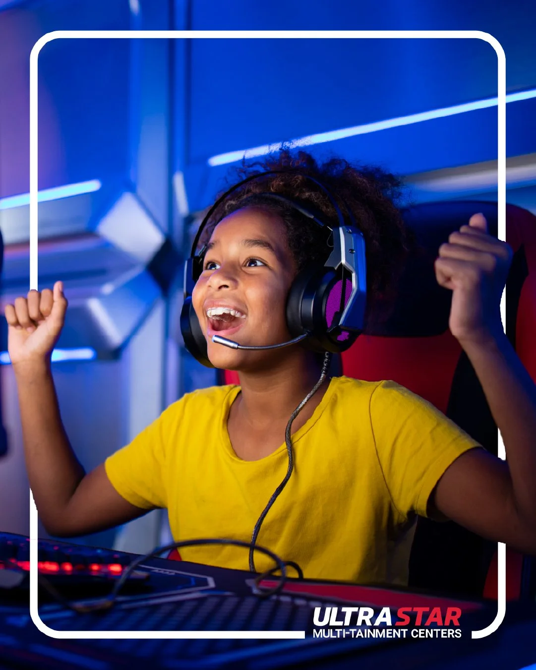
Social Media Posts
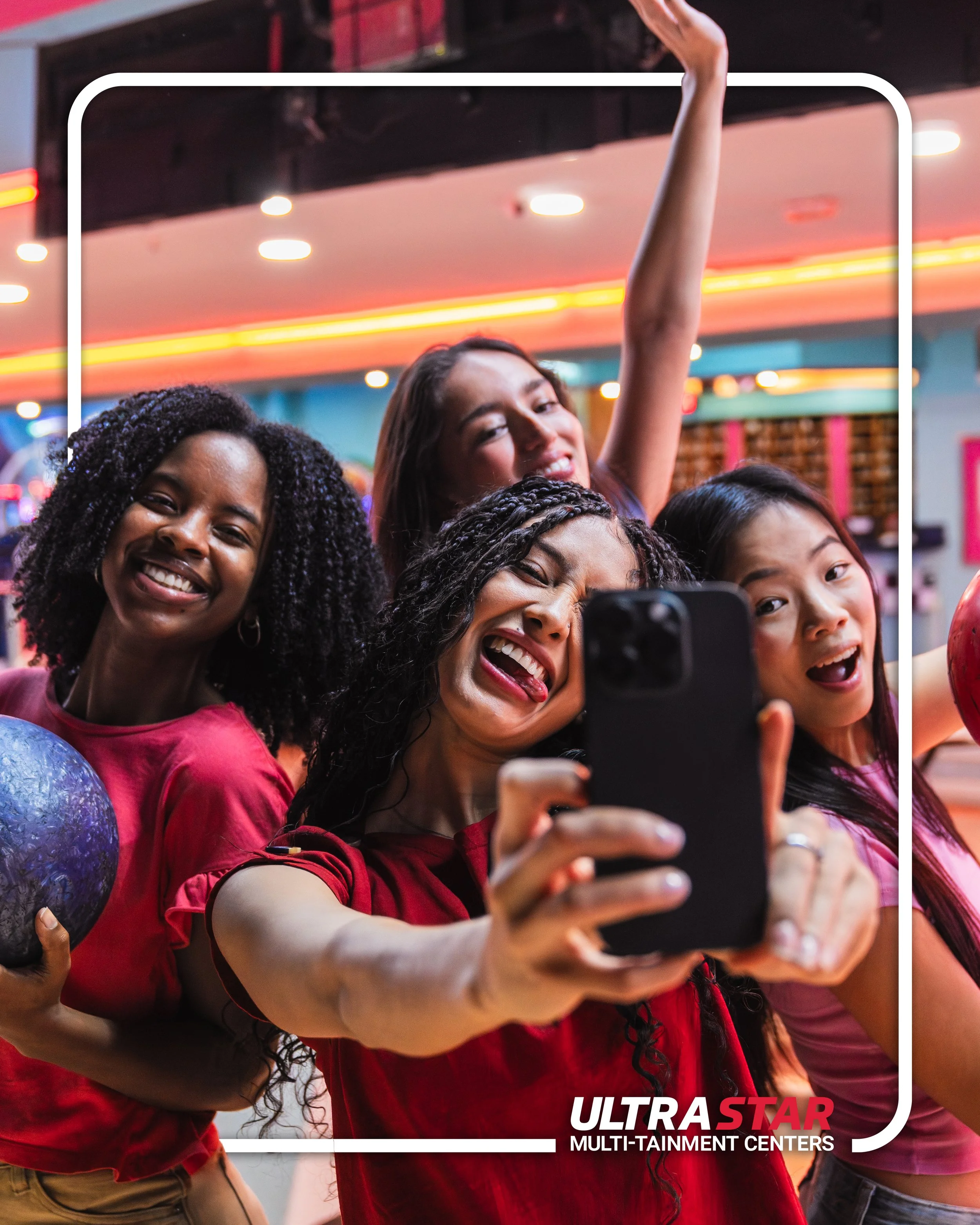
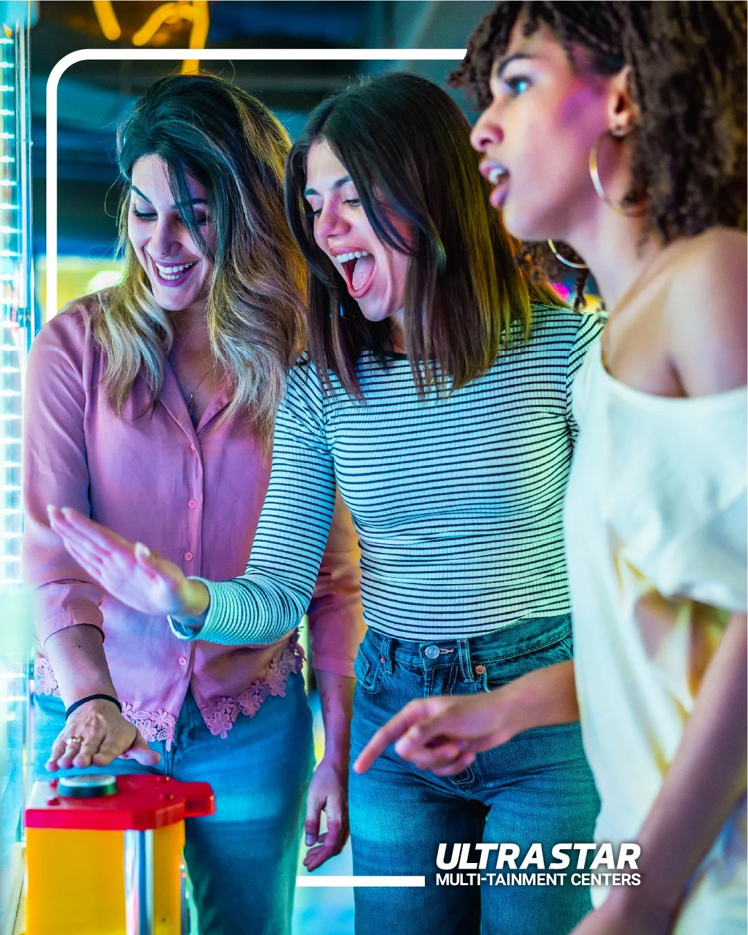
You’ll notice that our digital signage and social posts have a white border, or, frame. This became an essential graphic element through the course of our demographic study. I worked with UltraStar’s leadership to determine who their target audience is. Primarily, they want to attract families with children, couples, and - being just a few miles away from Western Carolina University - college age young adults.
The frame came into play when we decided that the visual language and positioning of UltraStar would be one that focused on making memories. In a world that begs for your attention to be in the palm of your hands, they actually want you to put your phone down and enjoy the here and now with people you love. Enter the frame - used to capture the memories that you make at UltraStar.
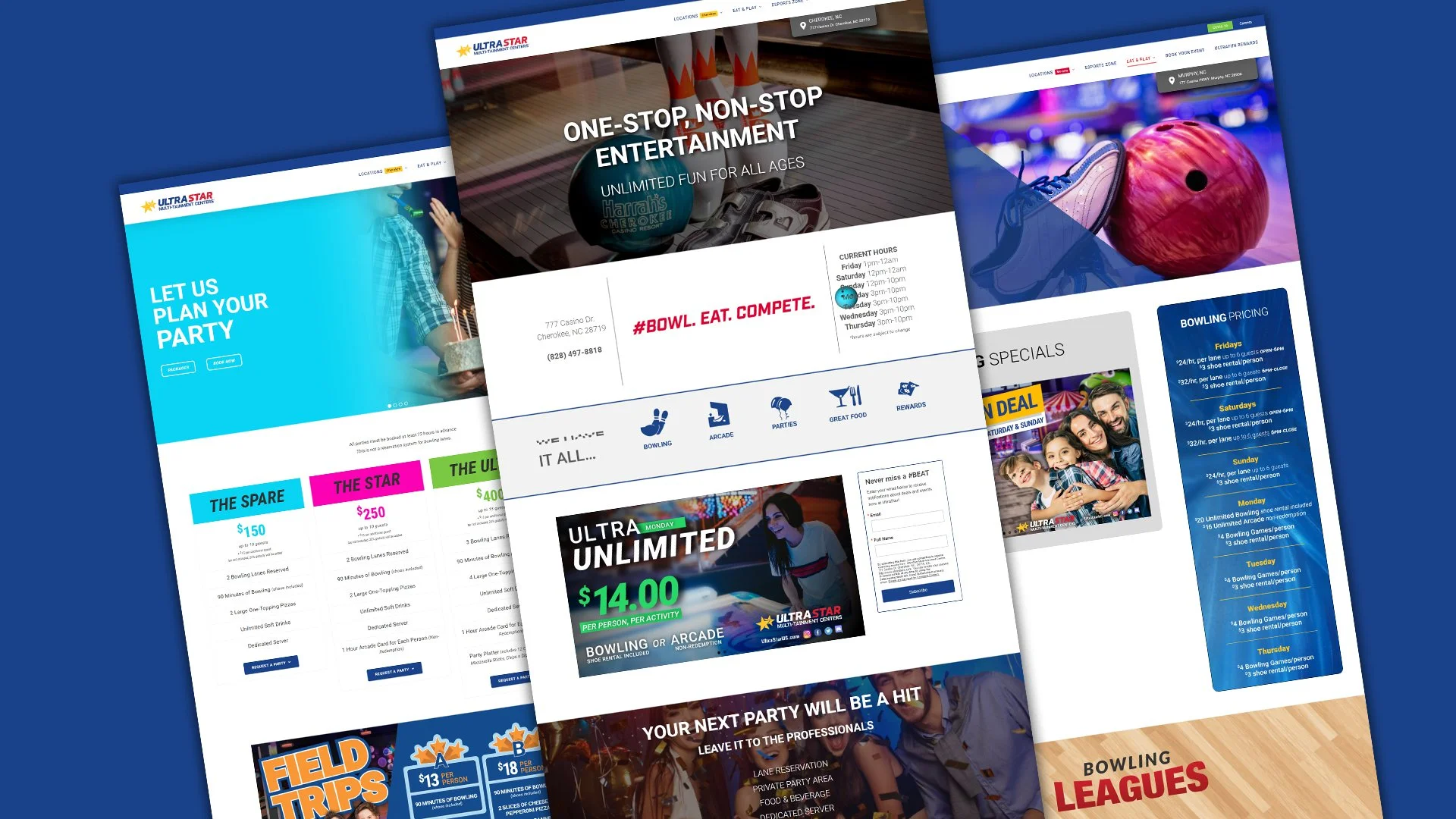
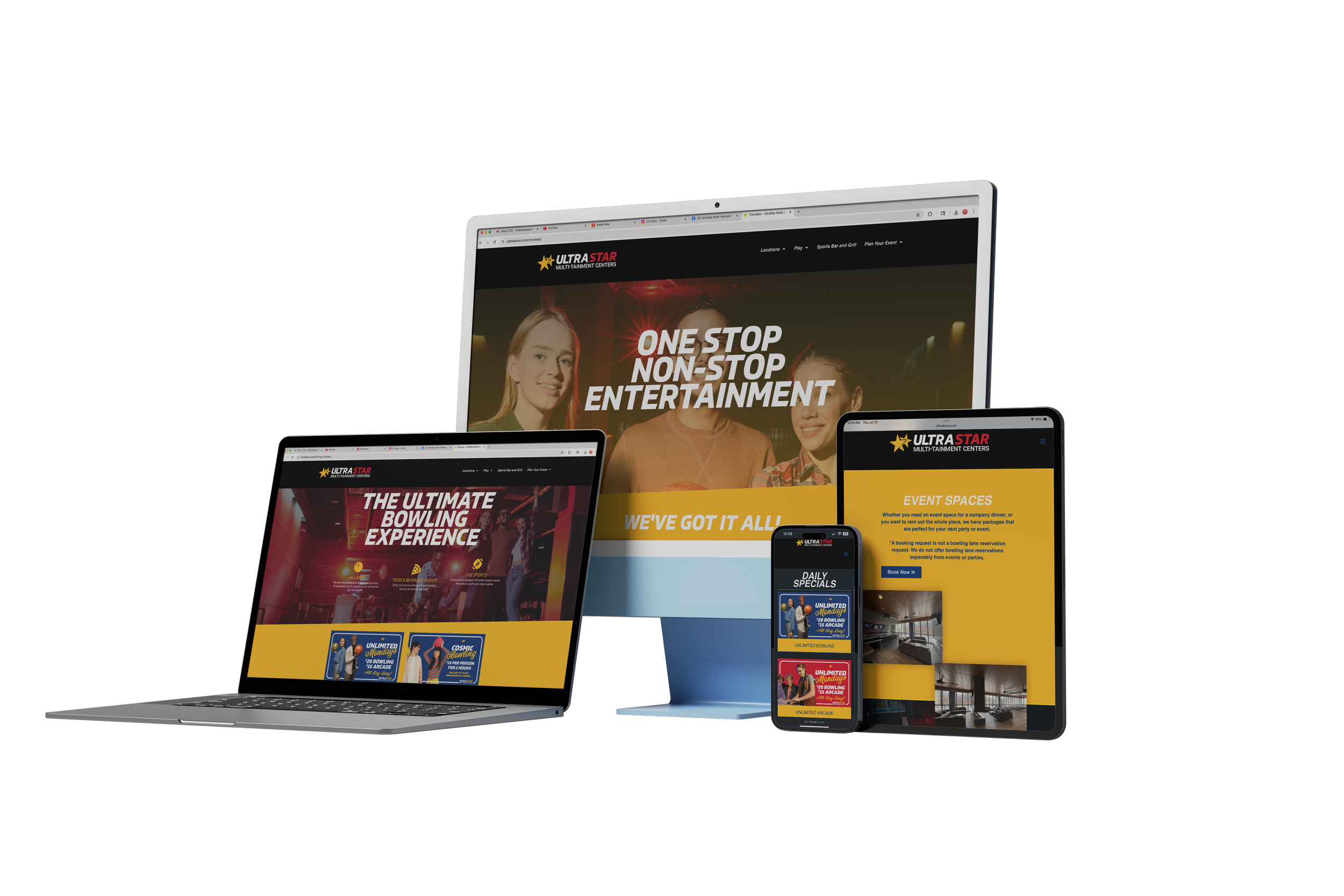
Updated Website


